India's Top Scientific Logo Expert

Scientific Logo Designing

Watch the intro
3000+ clients · 5+ countries · 12+ years
12+
Years of Experience
3000+
Satisfied Clients
5+
International Presence
99%
Success Rate
100%
Authenticity And Transparency

Vastu-Compliant Scientific Logo Design

CRAFTED WITH PERFECTION

Scientific Logo Analysis

Helps in comprehending the strengths and vulnerabilities of one's organization.

Scientific Logo Design

Gives a pristine guidance on eliminating obstacles, helping to achieve desired goal in one's Business

Most logo briefs start with a mood board. Ours starts with a birth date. That's the whole difference. A scientific logo design is built by calculating your business name down to its root number, identifying the planet that governs your trade, and then letting those two answers decide the shape, the colour, the angle and the direction of the mark. Aesthetics come after. Not instead. We've done this for 3,000+ clients across 5+ countries over 12+ years, from a single-counter shop in Delhi to companies operating out of four time zones. This page shows you the actual method, not a summary of it.

Scientific logo design is a method of creating a brand mark where the shape, colour, font, angle and direction are calculated from the founder’s birth details, the business name’s numerology, and the ruling planet of the profession. A conventional logo is judged on how it looks. A scientific logo is judged on whether every element agrees with the energy it’s meant to carry.

Here’s the test we apply. Take any logo off your competitor’s website. Ask the designer why the arrow points down-right instead of up-right. Ask why the wordmark sits below the symbol instead of beside it. Ask what number the name reduces to. If the answer is “it looked balanced,” you have a graphic. Not a logo built on a system.

We’re not against beautiful design. Half our work is spent making the calculated answer look good, because a mark that follows every rule and still looks amateur will damage the brand faster than a wrong colour ever could. The two things have to hold at once.

Every trade has a karaka graha, a significator planet. Jewellery belongs to Venus. Iron and heavy logistics belong to Saturn. Education and financial advisory belong to Jupiter. This isn’t a preference. It’s a classification that’s been stable across Vedic texts for a very long time, and it gives us the colour band, the shape family and the direction before we sketch anything.
Planet Trades it governs Colour band Shape family Direction
Sun (Surya) Government, leadership, pharma, gold, power, administration Gold, amber, deep orange Circle, radiating forms East
Moon (Chandra) Dairy, liquids, hospitality, travel, textiles, water White, silver, pale blue Crescent, wave, soft curve North-West
Mars (Mangal) Real estate, engineering, steel, defence, sports, surgery Red, coral, scarlet Upward triangle, sharp angle South
Mercury (Budh) IT, trade, accounting, media, broking, education Green, turquoise Multi-sided, angular, quick strokes North
Jupiter (Guru) Education, finance, law, advisory, publishing Yellow, saffron Expanding petal, arc, dome North-East
Venus (Shukra) Beauty, fashion, luxury, jewellery, entertainment White, pink, pastel, silver Oval, curve, symmetry South-East
Saturn (Shani) Logistics, iron, oil, mining, labour, construction Deep blue, charcoal Rectangle, grounded block West
Rahu / Ketu Speculative trade, foreign dealings, research, the unconventional Smoke grey, mixed tones Irregular, asymmetric Handled case by case

Two things about this table.

First, it’s a starting position, not a verdict. We cross-check the industry planet against your own chart. A jewellery business run by someone with a badly placed Venus doesn’t get a straight Venus logo. We’ll strengthen through a supporting planet instead, usually the one that’s best placed in the founder’s chart and compatible with the trade.

Second, the colour band is a band, not a single hex code. Venus covers a range from cold white through blush through champagne. Within that range we’re free to design. Outside it we’re not.

What we won’t do

We refuse colours more often than we recommend them. If you run a Saturn business and you want a hot red logo because your competitor has one, we’ll turn it down and explain why. That’s the point of the method. A lucky logo for business that ignores its own rules to please the client isn’t lucky. It’s just a logo with a story attached.

Here’s the piece almost no one talks about, and the piece that changes the most designs.

A logo isn’t static. Anything in it that implies movement, an arrow, a wing, a running figure, a flame, a vehicle, a swoosh, has a direction. That direction is read the same way we read the direction of a staircase or an entrance in Vastu for a business premises. The rules don’t change just because the surface is paper instead of a floor plan.

Why Logo Motion Should Rise Toward the North East

Ishanya, the North-East, governs clarity, growth and new beginnings. In a two-dimensional mark, that translates to motion travelling upward and to the right. This is the default we design toward, and it’s why so many well-performing corporate marks in every sector happen to slope that way. It reads as ascent to the eye and as growth in the system. The two agree, which is convenient.

Where Visual Weight Belongs in a Logo

Nairitya, the South-West, governs stability, storage and accumulated strength. Heavy visual mass, dense colour, thick strokes, the anchoring element of a composition, belongs bottom-left. Put your heaviest element top-right and the mark feels top-heavy to a designer and unstable to us. Both readings agree again.

The Downward Slope Mistake in Existing Logos

A diagonal falling from upper-left to lower-right is the single most frequent problem we correct in existing logos. It reads as decline. Many businesses have it without ever noticing, usually because it came out of a stock template or an italic typeface with an aggressive descender. It’s cheap to fix and the fix is usually invisible to customers.

Symbol on the Left or Right of the Brand Name

Symbol to the left of the wordmark, or above it, supports the name. Symbol to the right of the wordmark tends to lead the eye away from the brand name, which is the opposite of what a logo is for. There are exceptions, particularly for established brands where the symbol carries more recognition than the name, but for a business under ten years old, put the mark on the left.

Open and Closed Logo Shapes for a Growing Business

A fully enclosed shape, a solid ring, a sealed badge, a complete box, contains energy. That suits an institution, a trust, a school, a temple, anything whose job is to hold something steady. Read our notes on Vastu for schools for the same principle applied to buildings.

An open form, a broken ring, an arc with a gap, a shape that lets the eye out, releases energy. That suits an expanding business, a startup, a franchise, anything that needs to grow outward. Putting a growth-stage business inside a sealed badge is a common and avoidable error.

Feng Shui and Vastu | The Lo Shu Grid Parallel

Feng Shui encodes the same idea on a 3x3 grid rather than a compass. If you’ve worked with a Feng Shui consultant before and the vocabulary sounds different, the underlying logic maps across almost cleanly. We work in the Vastu compass because that’s the classical system we’re trained in, and because it gives finer resolution than nine squares.

The Process

Our Scientific Logo Design Process

First Slider Image
Second Slider Image
Third Slider Image
fourth slider lmage

Before we draw a line, we study your business goals and the energies behind them through Vastu, numerology and astrology. The first sketches put that on paper. Each line and curve is standing in for balance, direction and flow. This is where the brand's invisible structure starts to take visible form.

Structure goes in next. We build geometric grids on the Golden Ratio to get proportion and visual balance, then place circles, triangles and squares according to what the calculation asked for.

This stage draws on more than one discipline at once:

  • Sacred geometry and yantra for the underlying grid
  • Symbology for what a given form has meant across cultures, which matters more than most designers admit when a brand crosses borders
  • Graphology, applied to letterforms rather than handwriting, because the stroke weight and slant of a wordmark carry the same signals a signature does
  • Semiotics for how the mark will be read by a customer who has never heard of you
  • Colour psychology, checked against the Vastu colour band rather than replacing it

Nine disciplines going into one mark sounds excessive until you've watched a logo fail because someone got the letterform slant wrong on an otherwise correct design.

We adjust proportion, edges and spacing so the meaning and the aesthetics hold together. Every version gets tested for flow, stability and emotional read. Does it inspire trust, power, calm, devotion? Whether it's Safemed's clinical care, Shawarma King's heat and appetite, or Arya Samaj's institutional legacy, this is where the logo starts speaking in its own register.

The concept goes to vector. Every line, angle and curve gets redrawn to mathematical accuracy so the mark holds at 12mm on a visiting card and at 12 feet on a hoarding. Clean, crisp, and measurable.

We apply the Vastu-approved band identified in the calculation:

  • Gold and yellow for prosperity and vitality
  • Blue for trust and calm
  • Red and orange for drive and ambition
  • Green for growth and balance

These aren't chosen for fashion. They're chosen for the energy they emit and the harmony they bring to the brand.

Before final delivery, the logo is carefully evaluated against relevant Astrology and Vastu parameters to ensure it is well aligned with the owner, nature of the business, and industry.

Once the logo is finalised, we guide the client on the most suitable date and time to introduce and launch the new logo in the public domain. This may include its first use on the website, social media, signage, stationery, packaging, or other official brand platforms.

This ensures that the logo is not only visually and strategically appropriate for the business, but is also introduced at a time considered favourable for the owner and the brand.

Final files, usage guidance, and a short note on where the logo should and shouldn't be placed on your premises. That last part gets ignored constantly. A correctly designed logo mounted on the wrong wall is working against itself.

Not everyone should start over. If you’ve spent eight years building recognition around an existing mark, throwing it away is usually the wrong call, and we’ll say so even though a new design is the bigger invoice.

A logo audit is a separate service. We analyse what you already have against the same framework:

  • Business name root and compound, checked against the founder’s Mulank
  • Whether the current colours sit inside your planet’s band
  • Direction of any motion in the mark
  • Placement of visual weight
  • Open or closed form against your growth stage
  • Letterform slant and stroke weight
  • Where and how the logo is currently displayed on your premises

You get a written report with a verdict: correct, partially correct, or redesign recommended. Most audits land on partially correct, and most corrections are small. A colour shift of ten degrees. A diagonal reversed. The symbol moved from the right of the wordmark to the left. Customers usually don’t consciously notice, which is exactly what you want during a correction.

Audit turnaround: 7-10 days and delivery is 10 to 15 days. · Audit fee: starting from 15,000 INR · Adjustable against a full design if you go ahead.

Send these, and we can start:

  1. Founder’s date, time and place of birth. Time matters. “Around morning” isn’t enough for a chart, and we’d rather work with an approximate time flagged as approximate than a confident guess.
  2. Trading name exactly as it will appear on the logo. Including capitalisation and spacing.
  3. Registered legal name, if it differs.
  4. Date of incorporation or business commencement.
  5. Industry and sub-category. “Manufacturing” tells us nothing. “Pharmaceutical intermediates, B2B, exports to Africa” tells us the planet.
  6. Target market. Retail walk-in, B2B, export, online.
  7. Existing logo file, if you have one, in the highest quality you can find.
  8. Anything you’re attached to. A colour the family has used for two generations, a symbol from an older business, a script. Tell us up front. Sometimes we can hold it. Sometimes we can’t. Better to know on day one.

If there’s more than one partner, we usually work from the managing partner’s chart (the same principle we apply in Vastu for business partnership cases), and we’ll ask about the others where the ownership is genuinely split.

DeliverableIncluded
Final logo, vectorAI, EPS, CDR
Web formatsSVG, PNG with transparency
Print formatsPDF, JPG, CMYK versions
Colour variantsFull colour, single colour, reversed, greyscale
Concept rounds3
Revision rounds2
Written rationaleNumber, planet, colour and direction logic in writing
Usage and placement noteIncluded
NDANot offered

Turnaround: 7-10 days. Investment: starts from 15,000 INR. What moves the price: the number of concepts, whether a name correction is needed, stationery and collateral, and urgency. Taxes as applicable.

The whole process runs online. Clients across India and in the Middle East, North America, the UK, and Southeast Asia have completed it without a single in-person meeting. If you’re in Delhi NCR and would rather come to the office in Moti Nagar, that’s available too.
LOGO PORTFOLIO

Our Scientific Logo Design Portfolio

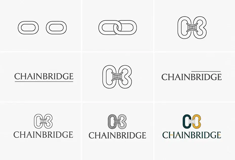
CHAIN BRIDGE logo

CHAIN BRIDGE

  • Trade: Society & Property Management
  • City: Mumbai, Pune
  • Business planets: Mercury, Saturn with Jupiter
The brief:
Chain Bridge wanted to grow its society and property management work in Mumbai and Pune, but a thin team, tight finances, and weak support systems were holding it back.
What we restrained:
We avoided unfavorable colours in the logo and ensured it was never fixed in a negative Vastu direction anywhere on their premises.
What we suggested:
A scientific, Vastu-aligned logo with the right angles and on-premises placement. Visiting cards and letterheads charged with Mercury, Saturn, and Jupiter energy for steady growth and stability.
Result:
Business picked up noticeably after the changes, and Chain Bridge is now working on its next phase of expansion.
Sarvang logo

Sarvang

  • Trade: Software development, mobile applications and process automation
  • City: Korba, Chhattisgarh
  • Business planets: Mars and Saturn
The brief:
Sarvang was stuck. New business was scarce, cash flow stayed blocked, and payments kept coming in late.
What we restrained:
Colours working against the brand were pulled out, and the logo was positioned to stay away from every Vastu-negative direction on site.
What we suggested:
A logo built on scientific and Vastu principles, with correct angles, energy, and placement. Visiting cards and letterheads drawing on Mars for drive and Saturn for discipline, aimed at growth and financial consistency.
Result:
Turnover doubled from the previous year, and the team credited the redesigned logo and collateral as a direct reason for the turnaround.
Global Active Clay LLP logo

Global Active Clay LLP

  • Trade: Chemical manufacturing
  • City: Delhi
  • Business planets: Saturn and Jupiter
The brief:
Global Active Clay LLP, a Delhi chemical manufacturer, set out to become a recognized name in international markets. The products were strong, but the company had no clear brand identity to stand out against global players.
What we restrained:
Each colour that clashed with the brand's energy was removed, and the logo placement was checked to rule out any Vastu-negative direction on the premises and across collateral.
What we suggested:
A scientific logo with correct Vastu geometry, energy, and strategic placement. Visiting cards and letterheads tuned to Jupiter for expansion and Saturn for stability, backing growth and international credibility.
Result:
The company broke into international markets it had struggled to reach, and its yearly figures rose sharply on the back of a stronger, clearer brand identity.
aadityac logo
Cloak Canvas logo
Craft Wardrobe logo
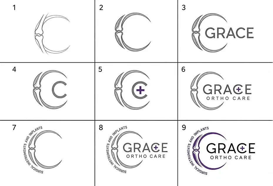
Grace Ortho Care logo
Blue Moon logo
Hiregig systems logo
Elitaire Electronics logo
Amratshree logo
Marvel Chemtech logo
Bariza Holidays logo
Queensland logo
Edufost Jyotirgaya logo
Electro Variant logo
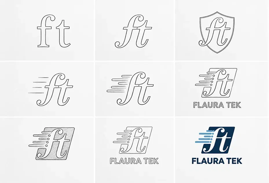
Flaura Tek logo
Greenlife Energy logo
Happy Developers logo
Hemvi logo
Krafting Experience logo
Nira FZCO logo
Rashmi jewellery logo
Rudraksha Technology logo
Rycroft logo
Saaras Daaginna logo
Safeorg logo
Shri Mahavir Packaging logo
Spot Self Storage logo
Sugosha logo

Industry Planet Typical colour band Shape leaning
Jewellery, fashion, beauty, salon Venus White, pink, champagne, silver Oval, symmetrical curve
IT, software, media, broking, marketing Mercury Green, turquoise Angular, multi-sided
Education, finance, legal, consulting Jupiter Yellow, saffron Arc, dome, expanding petal
Real estate, construction, engineering, steel Mars Red, coral Upward triangle
Logistics, transport, mining, heavy industry Saturn Deep blue, charcoal Rectangle, grounded block
Restaurants, hotels, dairy, travel Moon / Venus White, silver, warm neutrals Crescent, soft curve
Pharma, government-facing, energy, gold trade Sun Gold, amber, orange Circle, radiating form

Startups, established companies, shops, clinics, boutiques, factories and personal brands all fit. The framework doesn’t change with size. What changes is how much of the existing brand equity we have to protect while applying it. A three-month-old startup can take a clean-sheet answer. A thirty-year-old family business usually can’t, and shouldn’t have to.

For sector-specific premises guidance, see Vastu for shops, Vastu for makeup studios and Vastu for plots.

Worth thinking about before you fall in love with a design, not after.

A mark that follows every Vastu and numerological rule can still be refused by the Trade Marks Registry under the Trade Marks Act, 1999. The usual grounds are that it’s descriptive of the goods, that it’s not distinctive enough, or that something confusingly similar already sits in your class.

We design with that in mind: we push toward distinctive forms rather than generic industry symbols, we avoid the stock iconography that’s already crowded in most classes, and we’ll flag it if the direction you’re leaning looks hard to register. We’re Vastu consultants, not IP attorneys, so run the final mark past a trademark agent before you file and before you spend on signage. The search is inexpensive. Re-branding after a refusal isn’t.

12+ years. 3,000+ clients. 5+ countries. 99% success rate. 100% authenticity and transparency.

Led by Seema Bhatia, working out of Moti Nagar, New Delhi.

Three things that separate the work:

We show the calculation. You get the number, the planet and the direction in writing, not a claim that a calculation happened. If you ever want a second opinion from another consultant, you’ll have something concrete to hand them.

We say no. A good share of the briefs we take involve telling the client that a colour, a direction or a name they’re attached to won’t work. That’s the service. A consultant who agrees with everything is selling you a graphic design job with incense on top.

The logo connects to the premises. A correctly designed mark hung in the wrong direction on the wrong wall loses most of its benefit. We tell you where to put it, and if the premises need broader work, that’s a conversation we’re equipped to have. Start with Vastu for business.

Scientific Logo Designing

Scientific Logo Designing Video Guide by Seema Bhatia

5.0

Based on 58 Google Reviews

What clients say about their scientific logo

Google reviews from clients whose logo we designed on Vastu, numerology and astrology.

RRohitt Vijay Sharmaa12 days ago

I would like to sincerely thank Seema Bhatia Ma’am for designing the logo and complete brand identity for Navjewansh Private Limited with so much creativity, patience, and personal involvement. When Ma’am shared the logo concepts with us, our entire family was genuinely confused about which one to choose because every single design was so beautiful, unique, and attractive. It was honestly one of those situations where choosing just one design felt difficult because we loved them all. What impressed me the most was not just the creativity, but the guidance and thought process behind every design. Ma’am explained why particular colours were being selected, how the logo should represent our company, and how the logo, letterhead, visiting cards, and other branding elements should be designed. The way she explained everything clearly reflected her experience and deep understanding of branding and design. But beyond her professional expertise, what truly touched us was Ma’am’s nature. She is extremely kind-hearted, patient, and supportive. She went beyond the actual scope of her work and helped us with suggestions and guidance whenever we needed it. That personal involvement made the entire experience feel much more meaningful than just a client-designer relationship. For us, this was not simply about creating a logo for Navjewansh Private Limited. It was about giving an identity to something that we are building with our dreams, hard work, and emotions—and Ma’am understood that beautifully. Thank you so much, Seema Bhatia Ma’am, for being a part of our journey and for putting your heart into our brand identity. We are truly grateful for your creativity, guidance, kindness, and support. With heartfelt gratitude, Rohitt Vijay Sharmaa Navjewansh Private Limited

VVasudev Sharma12 days ago

"Thank you so much Layered Vastu for the amazing logo design! You listened to all my ideas and created the perfect design for my company. Special thanks to Seema Bhatia Madam for her wonderful support!"

aabhishek rawatt13 days ago

Very good results Loved your work

vvijay mane14 days ago

Good results after creation of New logo from Seema Ji thanks for your Best design and support and service .

PPuneet Gupta2 months ago

We took the vaastu logo services. And the process was very smooth and we really like the design which were shared to us. After using the logo within two years our business grew exponentially...!!! Thank you Ms. Seema for your services.

bbipin sadaria2 months ago

Layered vastu की सर्विस बहुत अच्छी लगी उन्होंने हर बात को बहुत अच्छे से समझाया और प्रैक्टिकल solutions दिए (Translated by Google) I really liked the service of Layered Vastu. They explained everything very well and gave practical solutions.

FAQ

Scientific Logo Design - FAQ

Scientific logo design is a method of creating a brand logo based on Vastu, numerology and astrology rather than appearance alone. The shape, colour, font, angles and layout are calculated from the founder's birth details and the nature of the business, so the mark is designed to support growth rather than only to look good.

A normal logo is judged on aesthetics. A scientific logo is judged on aesthetics and on whether every element agrees with the business name's root number, the trade's ruling planet, and Vastu direction. Same visual craft, an additional layer of constraint on top.

More than a template or a marketplace gig, and comparable to a competent independent design studio. Our starting price is 15k. The extra cost isn't the drawing; it's the analysis before it and the willingness to reject options that would have been quicker to approve. If price is the only consideration, a marketplace logo will be cheaper and will not have been calculated.

The analysis takes 1 week, the design rounds take 7-8 days, and delivery is 10 to 15 days.

Yes, if the name is causing the problem. There's no benefit to building a calculated logo around a name whose root fights the founder's Mulank. We check this first, and if a spelling correction is worth making, we tell you before design starts rather than after.

Both. See the logo audit section above. Most established businesses are better served by a correction than a replacement.

Startups, established companies, shops, clinics, boutiques, factories, institutions and personal brands, across any industry. The logo is calculated for each client's profession and objectives, so there's no sector it excludes.

We design toward distinctiveness and flag anything that looks difficult to register, but a trademark agent should run the final search before you file. See the trademark section above.

Our office is in Moti Nagar, New Delhi, and we work in person across Delhi NCR, including Gurugram, Noida, Faridabad, and Ghaziabad. We also consult online for clients across India and abroad, including in the UK, North America, the Middle East, and Southeast Asia.

Ready to Transform Your Space?

Get expert Vastu guidance from Seema Bhatia. Start your journey to harmony and prosperity today.

WhatsApp Us Call Now