
12+ years of Experience
- 3000+ Satisfied Clients
- 5+ International Presence
- 99% Success Rate
- 100% Authenticity And Transparency
Why Direction Matters More Than the Colour Name?
Most Vastu colour guides give you a colour per room. That misses the point.
The room itself is not the variable its direction is. A bedroom in the south-west follows different colour logic than a bedroom facing east. A kitchen in the south-east aligns naturally with fire-element shades; the same kitchen on the north side of a home needs a different approach.
Vastu Shastra maps eight directions to specific ruling deities, planets, and the Panchabhutas the five elements of earth, water, fire, air, and space. Each element has associated colours rooted in this classification system. Applying a colour without knowing the directional context is like prescribing medicine without a diagnosis.
Here is how the direction-element-colour framework works:
| Direction | Ruling Element | Deity / Planet | Recommended Colours | Avoid |
| North | Water (Jal) | Kuber / Mercury | Blue, green, white | Red, orange, dark grey |
| North-East | Water + Space | Ishanya / Jupiter | White, light yellow, cream | Red, black, dark green |
| East | Air (Vayu) | Indra / Sun | Light green, pink, white | Black, dark blue |
| South-East | Fire (Agni) | Agni / Venus | Orange, red, coral, pink | Blue, black, green |
| South | Fire + Earth | Yama / Mars | Red, orange, brown | Blue, white (as primary) |
| South-West | Earth (Prithvi) | Nairuti / Rahu | Beige, brown, cream, earthy yellow | Blue, green, white |
| West | Air + Space | Varuna / Saturn | White, grey, blue | Red, dark brown |
| North-West | Air (Vayu) | Vayu / Moon | White, light grey, cream | Red, orange |
Vastu Colours Room by Room: The Practical Guide
Direction sets the framework. Room function adds a second layer. Where they intersect is where the right colour lives.
Living Room
The living room typically faces east or north in Vastu-compliant homes. For east-facing living rooms: light green, soft pink, or off-white. For north-facing: blue-green tones or cream.
What to avoid: dark red, charcoal, or black on primary walls. These shades suppress the open energy the living room needs for social interaction and positive reception of guests.
Master Bedroom
The south-west is the ideal position for the master bedroom according to Vastu Shastra, this is the earth zone, associated with stability and rest. The colours that align: beige, chocolate brown, off-white, and earthy cream.
If your master bedroom faces east, which some floor plans produce, switch to light green or pink, which carry less grounding weight and suit the softer energy of the east.
Red in any bedroom is a consistent advisory against in Vastu practice. Red activates the fire element. It does not support the restful, stable energy a bedroom requires.
Children's Room
Green is the dominant recommendation here, specifically light green or sage. In Vastu colour theory, green maps to the north and the growth principle. For a child's study and rest space, it supports concentration and calm.
Bright yellow or strong orange as primary wall colours work against focus. They activate air and fire elements respectively, useful in social spaces, disruptive in rooms where sustained attention matters.
Kitchen
The kitchen belongs in the south-east, the fire zone. Orange, red, yellow, and coral are directionally correct choices. They align with the Agni element that governs cooking, digestion, and the fire principle in Vastu.
Blue and green are the two colours most commonly flagged in kitchen Vastu consultations. Both are water-element colours. Placing them in a fire-element zone creates elemental opposition, which in Vastu practice translates to disrupted energy in the space associated with family nourishment.
White works as a neutral when orange or red feel too strong. Pair it with a warm accent, terracotta tiles, an orange splashback, to maintain the directional alignment.
Pooja Room / Prayer Space
Yellow is the classical recommendation for the pooja room, specifically the north-east, which is the Ishanya corner. Yellow in Vastu colour theory maps to the Vayu (air) element and is associated with intellect, clarity, and spiritual attunement.
White and cream are equally appropriate. Both align with the light and clarity principle of the north-east. What does not align: dark shades of any colour, or red and orange on the primary walls of a prayer space.
Bathroom
White, light grey, and off-white are the consistent Vastu recommendations for bathrooms. The bathroom is a transitional space not one mapped to a specific deity or elemental purpose in classical texts, and neutral shades support its function without adding elemental interference.
Dark colours concentrate heaviness in a space that Vastu Shastra traditionally wants kept energetically light. This is practitioner consensus rather than a direct classical injunction, but it is consistent across multiple Vastu schools of practice.
Vastu Colours and the Five Elements: The Framework Behind the Rules
Every Vastu colour recommendation for your home is rooted in the Panchabhuta the five fundamental elements of nature. Understanding this principle matters because it reveals the reasoning behind the guidelines, not just the rules themselves
| Element (Panchabhuta | Associated Direction | Colour Family | Home Zone Application |
| Prithvi (Earth) | South-West, South | Yellow, beige, brown, earthy tones | Master bedroom, storage, heavy furniture zones |
| Jal (Water) | North, North-East | Blue, white, light green, teal | Study, prayer room, north-facing entrance |
| Agni (Fire) | South-East, South | Red, orange, coral, pink | Kitchen, dining room, fireplace wall |
| Vayu (Air) | East, North-West | Light green, white, light grey | Living room (east-facing), children's rooms |
| Akasha (Space) | Centre (Brahmasthan) | White, very light yellow | Central hall keep light and uncluttered |
Element-direction mapping based on Panchabhutas classification in Vastu Vidya; colour associations reflect traditional Vastu colour-element correspondence and LayeredVastu practitioner application.
Vastu Colours to Avoid and Why
The question of which colours to avoid gets less coverage than recommendations, but it matters just as much. Here are the consistent advisory positions across Vastu practice:
⦁ Black on interior walls- associated with Saturn and stagnant, heavy energy in Vastu colour theory. Acceptable in small decorative details; not as a primary wall colour in any room
⦁ Dark grey in the north-east- suppresses the Ishanya corner's role as the direction of clarity and spiritual practice
⦁ Red in the bedroom- activates fire energy that disrupts rest and can increase tension in relationships, according to practitioner consensus across multiple Vastu schools
⦁ Blue or green in the south-east kitchen- elemental opposition between water-family colours and the fire zone
⦁ Mixed contradictory elements in the same room- e.g. red (fire) and blue (water) as co-dominant colours creates what Vastu practice refers to as elemental conflict
None of these are absolute prohibitions in classical texts, Vastu Shastra does not function as a colour code. They are principles, and like any principle, context modifies application. A small accent of red in a south-west room is different from painting all four walls.
What We See in Consultations: Where Colour Choices Go Wrong
The most common mistake we encounter in home Vastu consultations is not a wrong colour, it is a colour chosen without directional reference.
A client in Gurugram had repainted their north-east pooja room a deep forest green, an Instagram-inspired shade that looked beautiful in photographs. Within the Vastu framework, that space is the Ishanya corner: the water-air junction, associated with clarity and spiritual practice. Forest green, while a water-family colour, carries the earth-growth weight of the Prithvi element when used as a saturated shade. It suppresses the light, open energy the north-east functions best with.
We recommended a shift to pale sage, same colour family, significantly reduced saturation. The client reported feeling the room had 'opened up' after the change. This is not anecdote as proof; it is an illustration of how Vastu colour principles are not binary but tonal.
In south-east kitchens, the reverse pattern appears. Homeowners choose white for its perceived cleanliness and simplicity. White is a water-air colour placed in a fire zone. It is not a disaster, Vastu is not that brittle, but it means the kitchen is operating against its directional grain. Adding a terracotta or warm coral accent restores elemental alignment without a full repaint.
What we consistently advise: choose within the right colour family first, then optimise for shade and saturation. Directional alignment outweighs individual colour preference in Vastu practice.
Why Choosing Us
100% Certified
Authentic Documents, Showcasing Legality100% Customer-Centric
Customization As Per Client's RequirementLifetime Assistance
Offering Services For The Entire LifespanFAQS
White, light yellow, beige, and soft green are the most broadly applicable Vastu colours. They align with multiple directional elements without creating elemental opposition. For specific rooms, the right colour depends on the room's direction, a north-east study and a south-east kitchen have different elemental requirements and different optimal colour families.
The Vastu Vidya and Brihat Samhita establish the direction-element-deity framework that underpins Vastu colour practice. The north-east is classified as Ishanya, the corner where water and space elements converge, associated with Jupiter. Colours that align with water (white, light blue) and space (white, very light yellow) are considered correct for this zone.
For a south-west master bedroom, the recommended direction in Vastu, beige, cream, chocolate brown, or earthy yellow are the correct choices. They align with the Prithvi (earth) element that governs the south-west. For east-facing bedrooms, light green or soft pink are more appropriate. Avoid red in any bedroom; it activates fire energy and disrupts restful sleep.
White is a water-element colour. The kitchen belongs in the south-east, the fire zone (Agni). Placing a water-family colour in a fire zone creates elemental opposition in Vastu practice. White is not forbidden, but it is not directionally optimal. Orange, coral, or warm yellow are better primary choices. If white is preferred, add a warm accent to restore elemental balance.
Not entirely. Black is associated with Saturn in Vastu colour symbolism and is consistently advised against as a primary wall colour, especially in the north-east, east, or north. As a small accent or decorative element it is acceptable in most Vastu practices. The concern is with black as a dominant shade, particularly in rooms linked to clarity, health, or prosperity zones.
A north-facing home office is the Vastu ideal, governed by Kuber and associated with wealth and career. Blue-green, white, or light blue are directionally correct here. For east-facing offices, light green supports focus and the Vayu element. Yellow is appropriate if the study or office is in the north-east. You can explore our guide on Vastu tips for work desk for more placement detail.
Start with a compass reading to identify which direction each room faces. Match the room direction against the element it corresponds to, south-east is fire, north is water, south-west is earth. Then check whether the current wall colour falls within the correct element family. If it does not, a repaint in the right family does not need to be an exact shade, moving directionally is enough.
The entrance colour depends on which direction the door faces. A north-facing door suits white, blue, or light green, the water and growth colours for the north. An east-facing door works with light green or pink. A south-facing entrance can carry red or brown shades without elemental conflict. Avoid black as the primary colour for any main entrance regardless of direction.
Checklists work for straightforward directional matches. If your home has irregular directions, combined-use rooms, or you're planning a renovation where colour and structural changes overlap, a proper Vastu consultation is more reliable. A checklist cannot account for how your specific floor plan balances elements across zones. LayeredVastu offers directional home consultations that cover colour alongside placement and spatial analysis.
White, cream, and light yellow are the standard Vastu recommendations for a north-east prayer room. The north-east is the Ishanya corner, classified in Vastu Vidya as the zone where water and space elements converge, associated with clarity and spiritual practice. Avoid dark greens, reds, or any saturated earth tones here; they suppress the light, open energy this corner functions best with.

Send Your Query
Related Posts

How Vastu & Numerology in Logo Design Propel Your Business Forward
Unlock your business potential by incorporating Vastu and Numerology i...Read More
10 Vastu Shastra Tips to Completely Transform Your Home
Implementing Vastu principles can improve your home and enhance your o...Read More
Wristwatch Analysis: How Your Watch Influences Your Life
Wristwatch analysis explores how a watch's type, color, shape, and siz...Read More
Optimizing Small Living Space with Vastu Principles
Ancient Indian architecture offers techniques for creating harmony and...Read More
Harnessing Prosperity: Mastering Wealth Through Vastu Shastra
Vastu Shastra, an ancient architectural philosophy, can align living s...Read More.jpg&w=750&q=75)
Mastering Company Logo Vastu for Enhanced Business Success
A Vastu-aligned logo is a conduit for success, resonating with physica...Read More
Vastu for Work Desk The Right Sitting Direction for Focus, Income, and Authority
Find the best Vastu direction for your work desk to boost concentratio...Read More
वास्तु शास्त्र के अनुसार लोगो डिजाइन
व्यवसाय के लिए सर्वोत्तम लोगो डिज़ाइन करने के लिए, आप वास्तुशास्त्र की...Read More
Vastu Tips For BP Control: Time to Shift Your Burner!
Hey there! It's a common thing, you know, to have blood pressure probl...Read More
Logo Design As Per Vastu Shastra
Logo design as per vastu must be directed in the upward direction whic...Read More.jpg&w=750&q=75)
Factory Vastu: A Blueprint for Success
By incorporating Vastu principles into your factory's design and layou...Read More
Vastu Shastra Myths: What Classical Texts Actually Say
Vastu Shastra myths, debunked. See what classical texts like Brihat Sa...Read More
Vastu For Rental Properties: Enhancing Well-Being and Success
Living in a rented property doesn't mean you have to forgo the benefit...Read More
Enhancing Your Child's Education Through Mahavastu Principles
As parents, creating an optimal learning environment for your child is...Read More
Logo Design And Branding As Per Vastu Principles
Incorporating Vastu principles into logo design and branding can be a ...Read More
Vastu for North-East Facing House: Classical Rules & Room Guide 2026
A north-east facing house is considered the most auspicious in Vastu S...Read More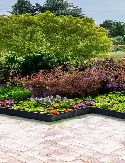
Creating A Vastu-Compliant Garden : Tips For Natural Harmony
A Vastu-compliant garden is not only visually appealing but also a sou...Read More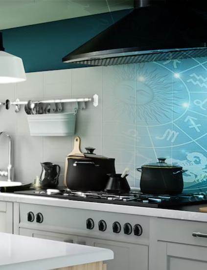
Vastu in the Kitchen : Energizing Your Cooking Space
Cooking in the kitchen is more than simply a means to an end; it's the...Read More
Vastu Compass And Directions : How to Find the Facing of Your House
Vastu Shastra, the ancient Indian science of architecture, lays great ...Read More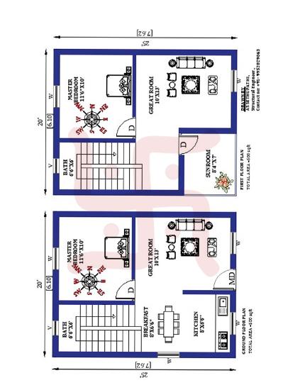
Creating an Optimal Floor Plan for Residence Based On Modern Vastu Principles
Designing an optimal floor plan for a residence based on modern Vastu ...Read More
Unveiling The Path To Harmony : Common Vastu Mistakes To Avoid
In our pursuit of a harmonious and prosperous life, it is essential to...Read More
Decoding The Path To Harmony : Choosing A Proficient Vastu Consultant
Choosing a qualified and experienced Vastu consultant is a vital step ...Read More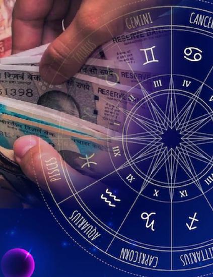
Unleashing Abundance : Harnessing Vastu for Wealth and Prosperity
Incorporating the principles of Vastu Shastra into our living and work...Read More
Vastu for Good Health: 12 Tips That Actually Make a Difference
Struggling with low energy, poor sleep, or frequent illness? These 12 ...Read More
Enhancing Relationships with Vastu Shastra
In the journey of life, the quality of our relationships is a determin...Read More
Name Correction in Numerology: Solution to Many Life Problems
Name is everything and this is the reason why people focus on having a...Read More
Produce Quality, Earn More: Follow Vastu Tips for Factory
Vastu Shastra is all about design and planning that helps in building ...Read More
Vastu Tips for Commercial Space: Follow And Earn More Profits
Vastu is an imperative part of commercial space as it can affect the w...Read More.jpg&w=750&q=75)