12+ years of Experience
- 3000+ Satisfied Clients
- 5+ International Presence
- 99% Success Rate
- 100% Authenticity And Transparency
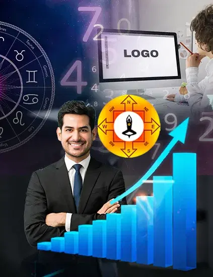
What Are Vastu Principles in Logo Design?
Vastu Shastra, at its core, is the science of how space, direction, and energy interact. Most people associate it with architecture. But logos occupy space too visual space, psychological space, and energetic space. Every logo has a shape (geometric or organic), a color palette, a direction of visual movement, and a structural weight. Vastu principles examine how these elements interact with the five elements earth, water, fire, air, and space and whether the combination supports or blocks the intended energy for that brand.
A logo for a real estate firm draws on earth energy. Heavy, grounded, stable. If that logo instead leans into fire energy sharp angles, aggressive reds it creates a subconscious dissonance. Clients sense it without naming it. They move on. This is not superstition. It is the intersection of Scientific Logo Design and modern psychology. The energy principles in Vastu align closely with what color theory and gestalt psychology have long argued design shapes perception, and perception drives behavior.
Why Logo Energy Affects Business Growth?
Your logo is often the first visual interaction a potential client has with your brand. That first impression is not just aesthetic it is energetic. Within milliseconds, the brain processes color, shape, and visual direction and assigns an emotional tone to what it is seeing. Vastu-aligned logos create resonance. The colors match the business's intended energy field. The shape reinforces stability or dynamism as needed. The direction of visual flow moves the eye toward openness rather than closure. This alignment builds trust before a single word is read.
Conversely, a logo misaligned with Vastu principles creates friction. Not obvious friction subtle friction. The kind that makes a prospective client click away without knowing why, or file your card in the maybe pile and never come back to it. For businesses where reputation and referrals drive revenue professional services, real estate, healthcare, financial advisory this energetic friction can quietly suppress growth for years. Business owners invest in better products, better service, better marketing. The logo stays the same, and so does the invisible ceiling.
Color, Shape, and Direction: What Goes Wrong
In Seema Bhatia's work as a Vastu Consultant in Delhi across business Vastu consultations, three elements consistently separate logos that attract from logos that repel: color alignment, shape geometry, and directional energy.
Color Alignment
Colors carry elemental associations in Vastu. Blue connects to water flow, communication, trust. Green aligns with growth and Mercury energy suited to finance, wellness, and education. Red is fire powerful for brands that require urgency or passion, but destabilising for businesses built on long-term trust. The mistake is not using the wrong color in isolation. It is using a combination that creates elemental conflict. A financial services logo with sharp red against electric blue puts fire and water in direct opposition. The logo looks bold, but it communicates internal tension. Clients do not feel settled.
Shape Geometry
Sharp, pointed shapes carry fire and air energy dynamic, cutting, forward-moving. Circles and ovals carry water and space energy inclusive, continuous, harmonious. Squares and rectangles hold earth energy stable, trustworthy, grounded. The shape should match what the business actually delivers. A legal firm with a jagged, abstract logo signals disruption rather than protection. A yoga studio with a rigid square logo feels clinical rather than calming. When shape and business intent align, the logo reinforces the brand promise without a single word.
Directional Energy
Direction is the most overlooked element. In Vastu, different compass directions carry different energetic qualities. North connects to wealth and new beginnings. East aligns with growth and health. South carries fire and intensity. West is linked to stability and established success. A logo with visual flow moving left west can anchor an established brand beautifully. A startup that needs to signal momentum might benefit from rightward, eastward visual direction movement toward opportunity. When the design direction conflicts with the brand's stage and intent, it creates visual static. Something feels off, even if no one can articulate what.
How to Apply Vastu Principles to Your Logo
If you are reviewing an existing logo or briefing a designer, here is how to think through a Vastu-aligned approach.
Start with your business's primary offering and the elemental energy it should project. Service businesses built on trust need earth and water energy. Creative and innovation-led businesses benefit from fire and air. Healthcare and wellness align with water and earth. Match your dominant color palette to this elemental base first. Next, examine your shape vocabulary. Is it consistent with what you want clients to feel? If your business needs to communicate safety, are your shapes grounded and closed or sharp and open? Choose geometry that reinforces, not undermines, the feeling you want to evoke.
Then consider your logo's visual direction. Where does the eye travel first, and where does it end? A logo that guides the eye outward and upward signals possibility. One that closes inward creates a sense of containment. Neither is inherently wrong but the choice should be deliberate, not accidental. Finally, look at the proportions. Vastu principles favor balanced, harmonious ratios. A logo that feels visually heavy on one side, or disproportionately tall or wide without intentional reason, creates energetic imbalance. The golden ratio, often cited in design, resonates with natural energy patterns for the same reasons Vastu does it reflects how nature organises itself.
Common Myths About Logo Vastu
The most persistent myth is that Vastu logo principles require a complete redesign. They rarely do. More often, small targeted adjustments shifting a color tone, softening an angle, rotating the visual weight are enough to shift the energetic alignment. The structure of the logo stays. The friction goes.
The second myth is that this only applies to new businesses. In practice, established businesses often benefit more. A brand that has been operating for years with a misaligned logo has been absorbing that friction for years. Even modest corrections can have measurable effects on the enquiries and referrals that come through the door. The third myth is that modern, minimalist design is automatically Vastu-neutral. Minimalism strips away clutter, but the underlying geometry, color, and direction are still present and still energetically active. A minimal logo can be deeply misaligned without its creator or client ever realising it.
The Logo Is Not Just a Symbol
A logo is your brand's first handshake. When it is energetically aligned color, shape, and direction working together it quietly does the work of building trust before a conversation begins. When it is misaligned, it adds friction you cannot see but your clients can feel.
Logo design vastu principles give you a lens that most designers do not use. The result is not just a logo that looks right it is one that works. If you are ready to understand what your current logo is communicating energetically, a consultation with Layered Vastu is a practical first step.
Why Choosing Us
100% Certified
Authentic Documents, Showcasing Legality100% Customer-Centric
Customization As Per Client's RequirementLifetime Assistance
Offering Services For The Entire LifespanFAQ
Frequently Asked Questions
Yes, in most cases. A Vastu logo review looks at color, geometry, and direction to identify misalignments. Often, targeted adjustments tonal shifts, proportion changes, or minor shape modifications are enough to improve energetic alignment without changing the core identity.
It depends on the business type. Earth-based businesses benefit from blues, greens, and deep neutrals. Health and wellness brands align well with greens and whites. Fire-energy businesses can use reds and oranges strategically. The key is elemental consistency across the palette.
In Vastu, directional energy is meaningful. Visual flow toward the east or north is generally positive for growth-oriented brands. Logos that guide the eye downward or toward the south can create a subtle sense of weight or resistance. This is subtle but cumulative especially in a saturated market where differentiation happens at the subconscious level.
A few indicators: consistent difficulty converting qualified enquiries, a brand that feels hard to explain, clients who struggle to refer you despite good service. A Vastu logo consultation with Layered Vastu maps the design against elemental and directional principles to identify specific friction points.
It is an extension of the same principles applied to visual identity rather than physical space. The directional, elemental, and energy frameworks are the same. What changes is the medium instead of doors, walls, and zones, you are working with colors, shapes, and proportions on a two-dimensional surface.

Send Your Query
Related Posts
How Vastu & Numerology in Logo Design Propel Your Business Forward
Unlock your business potential by incorporating Vastu and Numerology i...Read More
10 Vastu Shastra Tips to Completely Transform Your Home
Implementing Vastu principles can improve your home and enhance your o...Read More
Wristwatch Analysis: How Your Watch Influences Your Life
Wristwatch analysis explores how a watch's type, color, shape, and siz...Read More
Optimizing Small Living Space with Vastu Principles
Ancient Indian architecture offers techniques for creating harmony and...Read More
Harnessing Prosperity: Mastering Wealth Through Vastu Shastra
Vastu Shastra, an ancient architectural philosophy, can align living s...Read More.jpg&w=750&q=75)
Mastering Company Logo Vastu for Enhanced Business Success
A Vastu-aligned logo is a conduit for success, resonating with physica...Read More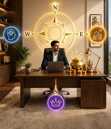
Vastu for Work Desk The Right Sitting Direction for Focus, Income, and Authority
Find the best Vastu direction for your work desk to boost concentratio...Read More
वास्तु शास्त्र के अनुसार लोगो डिजाइन
व्यवसाय के लिए सर्वोत्तम लोगो डिज़ाइन करने के लिए, आप वास्तुशास्त्र की...Read More
Vastu Tips For BP Control: Time to Shift Your Burner!
Hey there! It's a common thing, you know, to have blood pressure probl...Read More
Logo Design As Per Vastu Shastra
Logo design as per vastu must be directed in the upward direction whic...Read More.jpg&w=750&q=75)
Factory Vastu: A Blueprint for Success
By incorporating Vastu principles into your factory's design and layou...Read More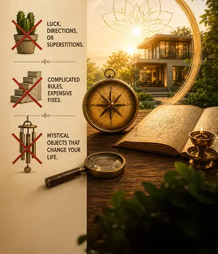
Vastu Shastra Myths: What Classical Texts Actually Say
Vastu Shastra myths, debunked. See what classical texts like Brihat Sa...Read More
Vastu For Rental Properties: Enhancing Well-Being and Success
Living in a rented property doesn't mean you have to forgo the benefit...Read More
Enhancing Your Child's Education Through Mahavastu Principles
As parents, creating an optimal learning environment for your child is...Read More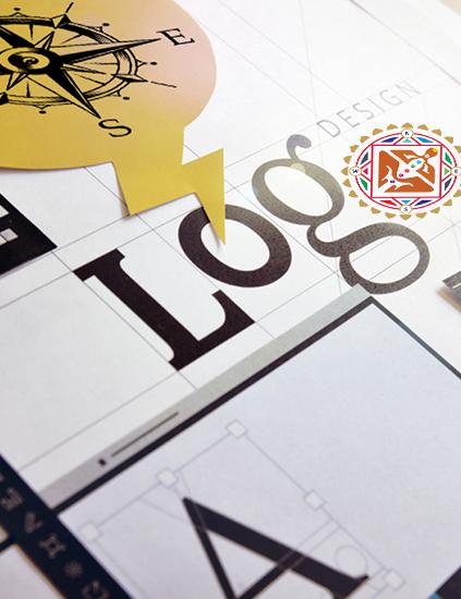
Logo Design And Branding As Per Vastu Principles
Incorporating Vastu principles into logo design and branding can be a ...Read More
Vastu for North-East Facing House: Classical Rules & Room Guide 2026
A north-east facing house is considered the most auspicious in Vastu S...Read More
Creating A Vastu-Compliant Garden : Tips For Natural Harmony
A Vastu-compliant garden is not only visually appealing but also a sou...Read More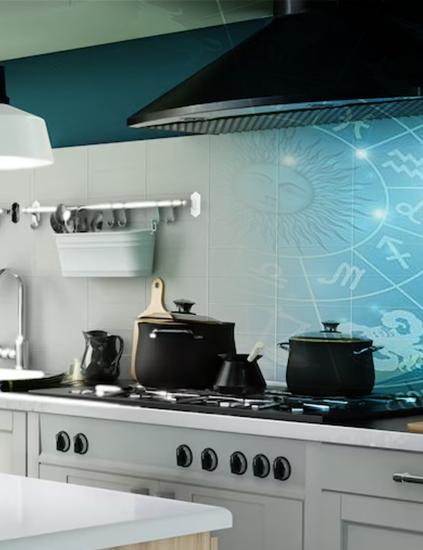
Vastu in the Kitchen : Energizing Your Cooking Space
Cooking in the kitchen is more than simply a means to an end; it's the...Read More
Vastu Compass And Directions : How to Find the Facing of Your House
Vastu Shastra, the ancient Indian science of architecture, lays great ...Read More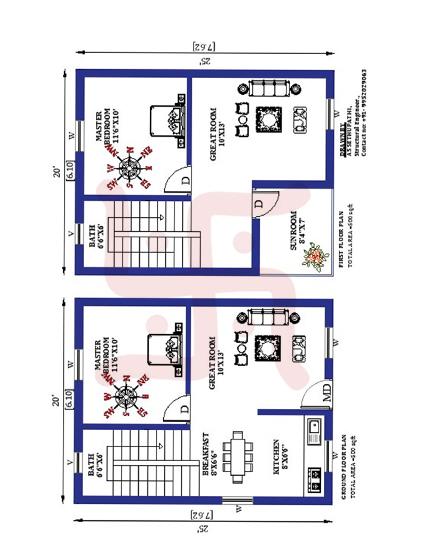
Creating an Optimal Floor Plan for Residence Based On Modern Vastu Principles
Designing an optimal floor plan for a residence based on modern Vastu ...Read More
Unveiling The Path To Harmony : Common Vastu Mistakes To Avoid
In our pursuit of a harmonious and prosperous life, it is essential to...Read More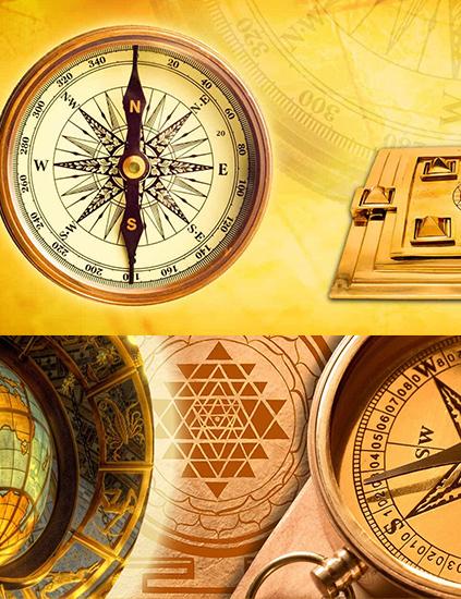
Decoding The Path To Harmony : Choosing A Proficient Vastu Consultant
Choosing a qualified and experienced Vastu consultant is a vital step ...Read More
Unleashing Abundance : Harnessing Vastu for Wealth and Prosperity
Incorporating the principles of Vastu Shastra into our living and work...Read More
Vastu for Good Health: 12 Tips That Actually Make a Difference
Struggling with low energy, poor sleep, or frequent illness? These 12 ...Read More
Enhancing Relationships with Vastu Shastra
In the journey of life, the quality of our relationships is a determin...Read More
Name Correction in Numerology: Solution to Many Life Problems
Name is everything and this is the reason why people focus on having a...Read More
Produce Quality, Earn More: Follow Vastu Tips for Factory
Vastu Shastra is all about design and planning that helps in building ...Read More
Vastu Tips for Commercial Space: Follow And Earn More Profits
Vastu is an imperative part of commercial space as it can affect the w...Read More
Vastu Colors for Home: What Each Direction Actually Needs
Which Vastu color belongs in which room, and why direction matters as ...Read More.jpg&w=750&q=75)
Harmonizing the Quintet of Elements
The term "Panchtatva" combines "panch," meaning five, with "tatva," de...Read MoreReady to Transform Your Space?
Get expert Vastu guidance from Seema Bhatia. Start your journey to harmony and prosperity today.