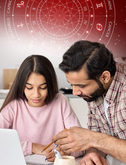
What Is Logo Shastra - And Why It Is Not Just Design
Logo Shastra is the applied study of how a brand's visual identity interacts with the energetic and psychological environment it operates in. It draws on ancient Shastra principles specifically the understanding that shapes, colours, directions, and proportions carry inherent energy and applies them to modern brand-building decisions.
An aesthetic logo satisfies the eye. An energy-aligned logo satisfies something deeper. It creates an unconscious sense of trust, stability, and attraction in the people who encounter it. The difference is not philosophy. It is measurable in client conversion, brand recall, and the speed at which a new business builds credibility.
At Layered Vastu, Seema Bhatia has observed this distinction across hundreds of brand assessments. Founders who come in frustrated with marketing performance often find the issue is upstream the logo itself is creating what Logo Shastra practitioners call 'leaking energy': a subtle mismatch between what the brand is trying to attract and what its visual identity is actually projecting.
Why First-Year Startups Are Most Vulnerable to Brand Energy Leaks
When a business is new, it has no historical momentum. It cannot rely on decades of trust or a loyal customer base. What it has is its presence and the logo is the most visible part of that presence. In the first 12 months, brand energy either builds or bleeds, and the logo is often the deciding factor. The typical startup builds its logo around one of three things: the founder's personal taste, a trending visual style, or a budget constraint. None of these are wrong in themselves. The problem is that none of them account for what the business actually needs to attract.
A tech startup using sharp, angular letterforms for a “bold” identity faced stalled deals-clients perceived them as intimidating. A Logo Shastra review revealed the aggressive energy signaled confrontation, not collaboration. By shifting to subtle rounded terminals and a softer secondary palette, client communication improved within weeks. These aren’t coincidences-they’re patterns backed by Scientific Logo Design, aligning brand visuals with user psychology, trust, and conversion-focused intent.
Aesthetic Logos vs Energy-Aligned Logos: The Actual Difference
Here is the honest comparison most designers will not give you.
Aesthetic logos are built around what looks good typography trends, colour psychology in its most basic form, and visual balance. They are evaluated by how they appear on a screen or a business card. There is nothing wrong with good aesthetics. The problem is that aesthetics is the end of the process for most designers, not a layer within a larger system.
Energy-aligned logos are built around what the brand needs to attract, sustain, and communicate at a frequency that precedes conscious thought. They account for the directional energy of the primary element (which way the mark faces or points), the numerical weight of the letterforms, the colour's relationship to the founder's birth energy and the business's primary activity, and the geometric proportion of the symbol or wordmark.
A wellness brand run by a founder with a Pitta-dominant constitution using sharp red triangles in its logo is working against itself. A finance-adjacent brand using circular, open forms is potentially leaking stability energy that clients subconsciously register as unreliability. These are not speculative claims they are patterns observed across real business assessments conducted through Layered Vastu's Logo Shastra service.
The corrected logos in these cases are often not dramatically different visually. But the energetic alignment changes entirely. And so do the results.
How Logo Shastra Works in Practice: A Framework for Founders
If you want to assess whether your current logo is energy-aligned, here is a practical starting framework:
- Direction of the primary mark: Where does your logo 'point' or 'face'? Eastward-facing marks generally support growth and new beginnings. Westward-facing forms can indicate withdrawal or conclusion energy. This is not absolute it is contextual but it is a starting question.
- Colour and its energetic function: Colours carry more than mood. Red activates which is useful in some industries and counterproductive in others. Blue stabilises, which is excellent for finance or healthcare but can dampen the activating energy a startup needs in its early growth phase. The question is not 'what colour looks good' but 'what does this brand need to do.'
- Shape language and its structural message: Closed shapes (complete circles, enclosed forms) retain energy. Open shapes allow energy to flow outward good for service-based businesses that want to project generosity and openness, but potentially problematic for brands that need to hold and accumulate resources.
- Founder alignment: In Logo Shastra, the brand is an extension of the founder. A logo that contradicts the founder's core energy creates friction in how the business feels to run. This is one of the more subjective assessments but often the most clarifying one.
A qualified Logo Shastra review from Layered Vastu goes deeper than this framework but this is enough to begin asking the right questions before your next rebrand.
Common Myths About Logo Shastra - Addressed Directly
Myth: Logo Shastra is superstition dressed up as branding. Reality: The underlying principles draw on the same spatial and proportional science that informs Vastu Shastra the study of how built environments affect the people who inhabit them. Applied to logos, it is a systematic framework, not a belief system. You do not have to believe in it for it to work. The patterns are observable.
Myth: Any colour change or adjustment fixes the problem. Reality: Swapping red for blue because someone on the internet said it helps is not Logo Shastra. A genuine assessment is specific to the business, its founders, its industry, and the gap between what the brand intends to attract and what the current logo is projecting. DIY corrections based on general guidelines often create new misalignments.
Myth: Small startups do not need this level of detail. Reality: Small startups need it most. When you have no historical brand equity, everything in your brand is doing heavy lifting. A misaligned logo in a small business has a proportionally larger effect than in an established brand with years of momentum behind it.
Your Logo Is Working 24 Hours a Day - Make Sure It Is Working For You
A logo is not a passive symbol. It is in motion every time someone sees it on your website, your business card, your social profiles, your invoices. In those fractions of a second, something is being communicated below the level of words. Logo Shastra for brand success is the discipline that makes sure what is being communicated is what you actually intend.
If your business feels harder to grow than it should, if clients hesitate without clear reason, or if your brand simply does not feel like it has traction your logo deserves a closer look. Visit layeredvastu.com to book a Logo Shastra consultation with Seema Bhatia and find out what your brand identity is actually saying.
Why Choosing Us
100% Certified
Authentic Documents, Showcasing Legality100% Customer-Centric
Customization As Per Client's RequirementLifetime Assistance
Offering Services For The Entire LifespanFAQS
Logo Shastra is a framework that evaluates and designs logos based on energy principles direction, colour frequency, shape geometry, and founder alignment rather than aesthetics alone. Regular logo design focuses on visual appeal and brand identity. Logo Shastra adds the question of what the logo is energetically projecting and whether that matches what the business needs to attract. At Layered Vastu, this is applied as a structured analysis, not an abstract concept.
Most logos can be corrected without a complete redesign. Logo Shastra corrections are often subtle a shift in primary colour, a refinement of the symbol's orientation, or an adjustment to the typography weight. The goal is alignment, not reinvention. Full redesigns are recommended only when the foundational structure of the mark is working against the business in multiple dimensions simultaneously.
Startups have no historical brand momentum to compensate for a misaligned identity. Every interaction a potential client has with a new brand is heavily influenced by its visual presence. An energy-aligned logo creates an unconscious sense of trust and stability that shortens the confidence-building phase. For first-year businesses especially, this is not a luxury consideration it is a foundational one.
Yes, Logo Shastra draws on the same underlying spatial and energetic principles that form the basis of Vastu Shastra specifically the understanding that direction, proportion, geometry, and energy flow are not decorative concepts but functional ones. Layered Vastu applies this framework to brand identity as part of a broader approach to energy alignment across environments, decisions, and design.
A focused Logo Shastra review through Layered Vastu typically takes one to two sessions. The first session covers the existing logo analysis what it is currently projecting and where the misalignments are. The second, if needed, delivers corrective guidance, including specific adjustments to colour, form, or direction. Founders usually receive a written summary with clear recommendations.


.jpg&w=750&q=90)
.jpg&w=750&q=90)


.jpg&w=750&q=90)


.jpg&w=750&q=90)