12+ years of Experience
- 3000+ Satisfied Clients
- 5+ International Presence
- 99% Success Rate
- 100% Authenticity And Transparency
What Logo Vastu Science Actually Means
Most people think of a logo as a visual identity tool. Something to look good on a visiting card. But every shape has a geometric signature. Every colour carries a frequency. Every direction the way a symbol points or the way text flows creates a subtle energetic pull. Vastu Shastra has always recognised that the physical world is made of five elements: earth, water, fire, air, and space. These elements don't disappear when you open Photoshop. They exist in your design choices too.
A logo with sharp, aggressive angles pointing inward may create a contracting energy. A circular logo with balanced proportions can represent continuity and trust. A logo using red prominently in a water-related business may create elemental conflict. None of this is arbitrary. It's applied geometry and colour science filtered through thousands of years of spatial wisdom. At Layered Vastu, the approach to logo analysis is grounded in this framework practical, structured, and free from fear-based interpretation.
Why Your Logo Matters More Than You Think
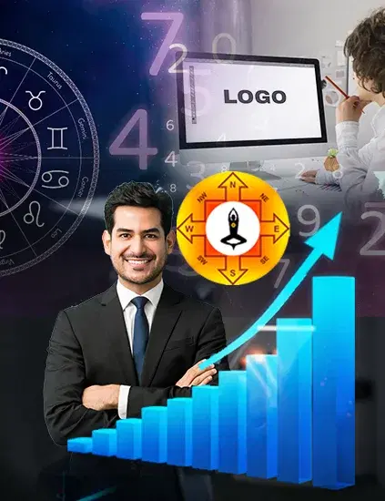
Your logo is the first energetic impression your brand makes. Before anyone reads your tagline or visits your website, they see your mark. That image enters their subconscious in under 400 milliseconds. Now imagine that image carries misaligned energy. Shapes that suggest instability. Colours that conflict with your industry's elemental nature. A symbol that, directionally, points away from opportunity.
This matters for business growth in very real ways. Brand perception studies consistently show that colour and shape affect trust, purchase intent, and recall. Vastu adds another layer: whether those design choices are energetically compatible with the owner's purpose, the business's sector, and the direction of growth they're aiming for. A factory owner dealing with recurring staff turnover may not immediately connect it to a logo that carries fire energy in a metal-dominant industry. But the misalignment exists and correcting it is often simpler than people expect.
Patterns Observed in Business Logos That Underperform
Over years of consultations, certain recurring patterns emerge in logos belonging to businesses that plateau or struggle.
Broken or incomplete shapes are the most common. A logo where the circle doesn't close, or where the brand name sits awkwardly disconnected from its icon, often reflects fragmented energy. What looks like a design choice is actually a structural imbalance.
Colour mismatches come next. A legal firm using orange as its dominant colour orange being associated with fire and rapid movement can create an energy of haste rather than authority. A healthcare brand using black prominently may suppress the healing, nurturing associations the business needs to build trust. Direction matters too. Logos where the primary symbol leans or points to the left Vastu's contracting direction may unconsciously repel growth energy. This isn't visible logic. But it's consistent in the pattern of businesses that stagnate.
There's also the issue of elemental conflict. If your business deals in liquids, finance, or communication, water and air elements should ideally dominate your palette and geometry. Fire-heavy logos in these sectors create a friction that clients feel, even if they can't articulate it.
How to Evaluate and Correct Your Logo as Per Vastu
You don't need to redesign everything. Most logo Vastu corrections are targeted and precise.
Colour mismatches come next. In scientific logo design, a legal firm using orange as its dominant colour orange being associated with fire and rapid movement can create an energy of haste rather than authority. A healthcare brand using black prominently may suppress the healing, nurturing associations the business needs to build trust. Direction matters too. Logos where the primary symbol leans or points to the left Vastu's contracting direction may unconsciously repel growth energy. This isn't visible logic. But it's consistent in the pattern of businesses that stagnate.
Check your shapes. Circles and ovals carry continuity and completion. Squares and rectangles reflect stability and structure. Triangles amplify fire energy. If your shape conflicts with your sector, that's a starting point for correction. Look at directionality. Does your logo's primary movement the way the eye flows across it point right and upward? That's an expansive, growth-oriented direction in Vastu. Left and downward movement is contracting.
A focused logo Vastu consultation at Layered Vastu maps all four of these elements together element compatibility, colour alignment, shape geometry, and directional energy and gives you a clear correction framework.
Common Misconceptions About Logo Vastu
Many people assume logo Vastu means adding religious symbols or replacing their design entirely with something traditional. That's not what this is. Logo design as per Vastu is not about making your brand look spiritual. It's about ensuring the visual decisions your designer made aren't unintentionally working against your growth. A modern, minimal logo can be fully Vastu-aligned. A traditional logo can be deeply misaligned. It also doesn't override quality products, strong marketing, or business fundamentals. Vastu is not a substitute for strategy. It is an additional layer of coherence removing invisible friction so that your efforts produce better results. And finally, this isn't one-size-fits-all. The same logo that works for a tech startup may be entirely wrong for a food business. Context, sector, founder's energy, and business intent all shape the analysis.
Conclusion
A logo is not just a graphic. It's a daily signal your business sends to clients, staff, and the market. If that signal carries misaligned energy even subtly it creates invisible friction that no amount of marketing can fully overcome. The good news is that most corrections are small, targeted, and fast to implement. If you want a structured logo Vastu review for your business, Layered Vastu offers consultations designed to identify exactly where the misalignment is and what to do about it.
Why Choosing Us
100% Certified
Authentic Documents, Showcasing Legality100% Customer-Centric
Customization As Per Client's RequirementLifetime Assistance
Offering Services For The Entire LifespanFAQ
Frequently Asked Questions
A logo Vastu review analyses your shapes, colours, element alignment, and directional energy together. A single element in isolation is rarely the whole picture it requires a structured assessment.
Not always. Many corrections involve colour adjustments, minor shape refinements, or repositioning elements. A full redesign is only recommended when the core geometry is fundamentally misaligned.
Yes. Whether your logo appears on a storefront, a website, or a mobile app, it carries the same energetic properties. The medium doesn't change the Vastu science behind the design.
Indirectly, yes. A brand with misaligned visual energy can affect how a workspace feels and how staff connect with the company's identity. Alignment at the logo level often supports broader organisational coherence.
Good design focuses on aesthetics and market positioning. Logo Vastu adds an energetic lens ensuring the visual choices are compatible with the business's elemental nature and growth direction. Both matter. They work best together.

Send Your Query
Related Posts
How Vastu & Numerology in Logo Design Propel Your Business Forward
Unlock your business potential by incorporating Vastu and Numerology i...Read More
10 Vastu Shastra Tips to Completely Transform Your Home
Implementing Vastu principles can improve your home and enhance your o...Read More
Wristwatch Analysis: How Your Watch Influences Your Life
Wristwatch analysis explores how a watch's type, color, shape, and siz...Read More
Optimizing Small Living Space with Vastu Principles
Ancient Indian architecture offers techniques for creating harmony and...Read More
Harnessing Prosperity: Mastering Wealth Through Vastu Shastra
Vastu Shastra, an ancient architectural philosophy, can align living s...Read More.jpg&w=750&q=75)
Mastering Company Logo Vastu for Enhanced Business Success
A Vastu-aligned logo is a conduit for success, resonating with physica...Read More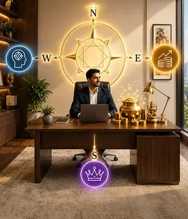
Vastu for Work Desk The Right Sitting Direction for Focus, Income, and Authority
Find the best Vastu direction for your work desk to boost concentratio...Read More
वास्तु शास्त्र के अनुसार लोगो डिजाइन
व्यवसाय के लिए सर्वोत्तम लोगो डिज़ाइन करने के लिए, आप वास्तुशास्त्र की...Read More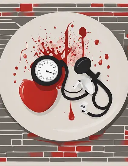
Vastu Tips For BP Control: Time to Shift Your Burner!
Hey there! It's a common thing, you know, to have blood pressure probl...Read More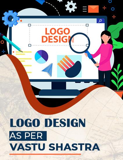
Logo Design As Per Vastu Shastra
Logo design as per vastu must be directed in the upward direction whic...Read More.jpg&w=750&q=75)
Factory Vastu: A Blueprint for Success
By incorporating Vastu principles into your factory's design and layou...Read More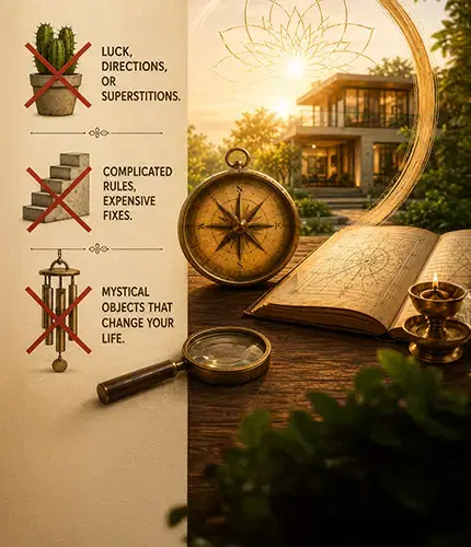
Vastu Shastra Myths: What Classical Texts Actually Say
Vastu Shastra myths, debunked. See what classical texts like Brihat Sa...Read More
Vastu For Rental Properties: Enhancing Well-Being and Success
Living in a rented property doesn't mean you have to forgo the benefit...Read More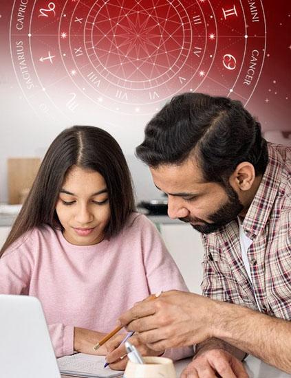
Enhancing Your Child's Education Through Mahavastu Principles
As parents, creating an optimal learning environment for your child is...Read More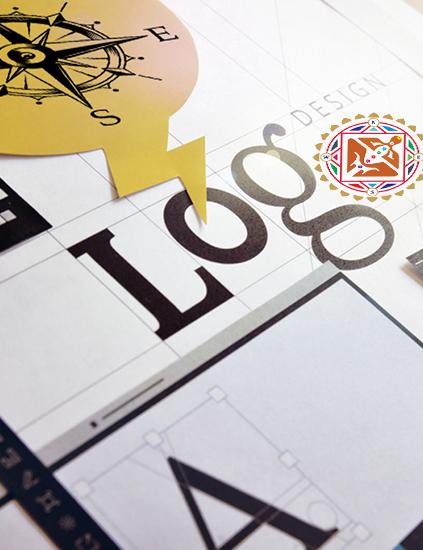
Logo Design And Branding As Per Vastu Principles
Incorporating Vastu principles into logo design and branding can be a ...Read More
Vastu for North-East Facing House: Classical Rules & Room Guide 2026
A north-east facing house is considered the most auspicious in Vastu S...Read More
Creating A Vastu-Compliant Garden : Tips For Natural Harmony
A Vastu-compliant garden is not only visually appealing but also a sou...Read More
Vastu in the Kitchen : Energizing Your Cooking Space
Cooking in the kitchen is more than simply a means to an end; it's the...Read More
Vastu Compass And Directions : How to Find the Facing of Your House
Vastu Shastra, the ancient Indian science of architecture, lays great ...Read More
Creating an Optimal Floor Plan for Residence Based On Modern Vastu Principles
Designing an optimal floor plan for a residence based on modern Vastu ...Read More
Unveiling The Path To Harmony : Common Vastu Mistakes To Avoid
In our pursuit of a harmonious and prosperous life, it is essential to...Read More
Decoding The Path To Harmony : Choosing A Proficient Vastu Consultant
Choosing a qualified and experienced Vastu consultant is a vital step ...Read More
Unleashing Abundance : Harnessing Vastu for Wealth and Prosperity
Incorporating the principles of Vastu Shastra into our living and work...Read More
Vastu for Good Health: 12 Tips That Actually Make a Difference
Struggling with low energy, poor sleep, or frequent illness? These 12 ...Read More
Enhancing Relationships with Vastu Shastra
In the journey of life, the quality of our relationships is a determin...Read More
Name Correction in Numerology: Solution to Many Life Problems
Name is everything and this is the reason why people focus on having a...Read More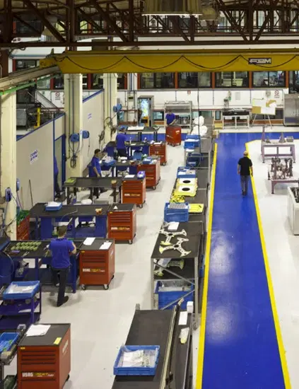
Produce Quality, Earn More: Follow Vastu Tips for Factory
Vastu Shastra is all about design and planning that helps in building ...Read More
Vastu Tips for Commercial Space: Follow And Earn More Profits
Vastu is an imperative part of commercial space as it can affect the w...Read More
Vastu Colors for Home: What Each Direction Actually Needs
Which Vastu color belongs in which room, and why direction matters as ...Read More.jpg&w=750&q=75)
Harmonizing the Quintet of Elements
The term "Panchtatva" combines "panch," meaning five, with "tatva," de...Read MoreReady to Transform Your Space?
Get expert Vastu guidance from Seema Bhatia. Start your journey to harmony and prosperity today.