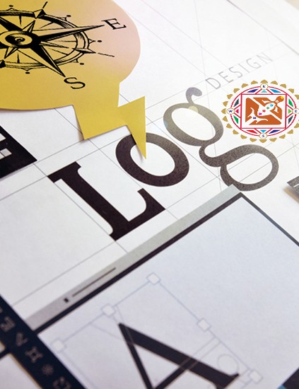
When you start a new business, the logo often feels like a small task.
- Pick a font
- Choose some colors
- Try a few options in Canva
- Done. Right?
Not really.
Your logo does much more than sit on a visiting card or website.
- It travels where you cannot go.
- It speaks for you in meetings you never attend.
- It creates a first impression before you say a word.
So, a logo should not be just “beautiful” or “modern.”
It should be designed to work with your energy and your business goals.
Scientific logo design takes this idea seriously.
- It uses Vastu, numerology, and astrology
- to shape a logo that is personal to you.
- Every detail is chosen with a purpose, not by guesswork.
Below are five core principles that explain why your current logo might be limiting your success.
These ideas help you see your logo as a business tool, not just decoration.
1. Your Logo Should Match Your Astrology, Not Just Your Taste
Most people create logos based on what they like.
They choose colors they love.
They follow trends from big brands or Pinterest.
Why Personal Preference Is Not Enough
But your personal choices may not match your personal energy.
In scientific logo design, the starting point is you.
Your date of birth, name, numerology, and astrology become key inputs.
The Two Core Foundations of Scientific Logo Design
1. You (Your Personal Energy)
Your date of birth, name, numerology, and astrology are carefully analyzed to understand Vastu for Child Birth your natural vibration and strengths.
2. Your Business (Nature of Work)
The nature of your business becomes the second layer that shapes the overall design direction.
How the Logo Is Designed
Based on this analysis, a designer decides:
- Which shapes support your energy
- Which colors are suitable for you
- Whether lines should be more horizontal or vertical
- How sharp or soft the elements should be
Nothing is random.
More Than Just a Design
When a logo is built on this data, it becomes more than art.
It becomes a symbol that syncs with your own vibration and the energy of your business.
A logo has real power only when it is designed to work specifically for you.
2. “Right” Industry Colors Can Still Be Wrong For You
Branding books often say:
- Red is great for food brands
- Green is perfect for wellness and spas
- Blue is ideal for IT and finance
These rules are useful, but they are not complete.
A color can work for an industry and still fail for the person who owns the business.
For example, red may be popular for restaurants.
But if red does not suit the owner’s numerology or planetary position, it may create struggle instead of growth.
- In such cases, you do not always need to avoid that color.
- You may need to balance it with other shades.
- Sometimes a specific mix or pattern of colors makes it compatible.
So, a strong brand identity should start from the founder, not just the industry.
The key question is not “What do other brands use?”
The key question is “What actually supports my energy and my business?”
3. A Lucky Logo Connects With the Senses Through the Five Elements
This approach also connects logo design with the five elements of nature.
Each element links to one of the human senses.
When you match the element with how your customer experiences your product, your logo feels more natural and powerful.
Here is a simple view:
- Water Element – Connects with taste. Ideal for food and beverage brands
- Air Element – Connects with touch. Useful for textiles, fabrics, shawls, and products where feel matters
- Fire Element – Connects with sight. Suits brands where visual impact is everything
- Earth Element – Connects with smell. Important for perfumes, incense, and certain food products
- Space Element – Connects with sound. Helpful for music, media, communication, and broadcasting Vastu for Business
When your logo reflects the right element, your brand speaks to the customer’s senses in a quiet but powerful way.
It feels “right” without them knowing why.
4. Shapes Carry Energy, Not Just Style
Shapes in a logo are not only design choices.
They carry a type of energy.
For example, the triangle relates strongly to the Fire element.
Fire represents heat, action, and transformation.
That is why many manufacturing or heavy industry logos use sharp shapes and triangles.
These shapes quietly signal power, production, and forward movement.
But here is the important part.
This does not mean every factory owner should rush to add triangles.
The shape must still suit:
- The founder’s personal chart
- The nature of the business
When the energy of Fire conflicts with the owner’s planetary alignment, a triangle can create pressure instead of progress.
Therefore, every curve, edge, circle, or angle in your logo should be selected thoughtfully.
Ask yourself:
- Does this shape support the element my business requires?
- Does it align with my numerology and astrology?
Without this alignment, even a well-designed logo can feel off.
5. Planets Influence Your Logo More Than You Think
Scientific logo design also looks at planetary energies.
Each field of work is influenced by certain planets.
These planets guide which colors, forms, and symbols will work best.
For example:
Education and knowledge-based sectors are deeply connected with Jupiter
- Logos for coaching, institutes, and learning platforms should respect Jupiter’s energy
- Colors, shapes, and symbols can be selected to strengthen this planet
Communication and connectivity businesses relate to Mercury
- This includes telecom, networking, digital agencies, and messaging platforms
- Design choices should support Mercury’s quick, sharp, and intelligent energy
When you align your logo with the ruling planet of your industry, you create another layer of support.
Your visual identity then works with both elemental and planetary forces.
The result is a logo that is not only attractive.
It is also tuned to the deeper patterns that impact growth, response, and opportunities.
Conclusion: Is Your Logo Lucky Or Just “Good Looking”?
Most logos are created to look modern and neat.
Some are even inspired by famous global brands.
But very few are designed to work for the specific person who owns the business.
A truly Lucky Logo for Business for business is not an accident.
It is the outcome of clear calculation and careful observation.
It respects:
- Your astrology and numerology
- The energy of your industry
- The five elements and five senses
- The influence of planets on your field
So, ask yourself:
Is your logo just a nice image on your card?
Or is it a personal, scientific symbol that quietly supports your money, growth, and reputation?
Look at your current logo with this new lens.
If it is only based on taste, trend, or templates, it may be time to rethink it.
A logo that is lucky for business does not only look good.
It opens doors, attracts the right people, and supports your journey every single day.
Why Choosing Us
100% Certified
Authentic Documents, Showcasing Legality100% Customer-Centric
Customization As Per Client's RequirementLifetime Assistance
Offering Services For The Entire Lifespan


.jpg&w=750&q=90)
.jpg&w=750&q=90)


.jpg&w=750&q=90)


.jpg&w=750&q=90)