12+ years of Experience
- 3000+ Satisfied Clients
- 5+ International Presence
- 99% Success Rate
- 100% Authenticity And Transparency
What Makes a Logo 'Scientific' in the Vastu Sense

The word 'scientific' here doesn't mean peer-reviewed research in the Western academic tradition. It means structured, observable and repeatable. Scientific logo design uses defined spatial principles, the same ones applied to architectural layouts, and Vastu-based logo analysis.
There are four primary factors Seema Bhatia examines in every logo analysis:
- Direction of primary visual movement: where does the eye travel first and where does it land?
- Geometric base- is the foundation triangle, square, circle or irregular? Each carries a distinct elemental association.
- Colour energy mapping: How do the chosen shades interact with the brand's operating direction (north, south, east, west)?
- Proportional balance is the visual weight distributed in a way that suggests stability, or does it create subliminal unease?
These aren't soft, interpretive questions. They produce specific, actionable outputs, which is why founders who have worked with Layered Vastu often describe the process as closer to an engineering audit than a branding consultation.
For a fuller introduction to how Vastu principles are applied to brand identity, Layered Vastu has covered this in depth in their article on logo design and branding as per Vastu - a useful read before going deeper here.
"Logos are not just visual marks. They are directional signals. The geometry you choose is the first message your brand sends before anyone reads a word." -Seema Bhatia
The 3 Million Logo Study: What Seema Bhatia Found
Over two decades of practice, Seema Bhatia built a reference archive of logos covering every major industry, from retail and FMCG to financial services, technology and healthcare. The database now exceeds 3 million marks. The patterns that emerged were not random. Across all sectors, a consistent correlation appeared between certain design characteristics and the long-term trajectory of the brands that carried them.
Upward Energy Flow
Logos with upward-moving visual elements, a rising arc, an ascending line, a triangular peak pointing skyward, or an open composition that draws the eye upward were significantly more likely to be associated with brand growth in the 5-year periods following their launch. The Vastu principle at work here is straightforward: upward movement aligns with the fire and growth quadrant of spatial energy.
Closed vs. Open Compositions
Brands that used tightly enclosed logo forms, circles or squares with all elements locked inside tended to perform well in sectors requiring trust and containment (finance, law, healthcare). But in growth-oriented sectors like technology, consumer goods and retail, these same closed forms correlated with slower top-of-mind recall. Open compositions, particularly those with one directional 'exit point,' performed better for brands seeking rapid recognition.
The Colour-Direction Disconnect
This was perhaps the most unreasoned finding. Many brands choose colours instinctively based on what 'feels right' or what competitors use, without accounting for the directional energy of their physical or digital presence. A north-facing business using deep red creates a clash in elemental energy that Vastu identifies as friction. Not catastrophic friction, but enough to create subconscious resistance in the audience.
Real Client Cases: From Logo Correction to Brand Shift
Abstract patterns are useful. Actual client outcomes are more useful. Here are three cases from Layered Vastu's practice that illustrate how scientific logo design as per Vastu translates into measurable brand impact into measurable brand impact.
Case 1: Delhi-Based Retail Brand, Karol Bagh
A mid-size retail chain in Karol Bagh approached Seema Bhatia after two years of flat growth despite a strong product range and good footfall location. The logo, a circular mark with the brand name enclosed inside, in deep burgundy on white, was clean and professional. But in Vastu terms, it was a containment structure pointed at a fire-energy sector without any release. The correction was modest: the outer circle was opened at the top, the typography was shifted to extend slightly beyond the circle's edge, and the colour was adjusted from pure burgundy to a warmer amber-gold. Within five months, the brand reported a 34% increase in repeat customer rate and measurably higher recall in a local survey.
Case 2: Tech Startup, South Delhi
A SaaS startup in South Delhi was six months’ post-launch with declining organic recall. Their logo was a sleek, modern geometric mark, two interlocking squares in cool grey and blue. Technically competent. Directionally neutral.
The Vastu analysis identified the issue: The visual weight of the interlocking squares was pulling left and downward, the direction of termination energy in Vastu spatial mapping. A rotation of 15 degrees, adjustment of the weight balance and the introduction of a warm amber accent line transformed the mark's directional energy. The founders reported that brand recognition improved significantly within the first quarter of the rebrand.
Case 3: Chandni Chowk Wholesale Business
An established wholesale business in Chandni Chowk wanted to expand into direct consumer sales. Their logo had been unchanged for 11 years, traditional Hindi typeface in red on white, no icon. The business had strong supplier relationships but weak consumer brand recall. The recommendation was to add an upward-pointing geometric element above the wordmark a simple rising line configuration in the brand's existing red and to introduce a secondary gold colour. The new logo went live eight months before a consumer trade event. At the event, unprompted brand recognition among new visitors was nearly three times higher than the previous year.
In each case, the change wasn't a rebrand. It was a directional correction and the market responded accordingly.
Applying Vastu Logo Principles: What to Check in Your Own Mark

If you are a startup founder or business owner looking at your current logo and wondering where it stands on these principles, here's a practical starting framework.
Step 1: Trace the Eye Movement
Look at your logo with fresh eyes and track where your gaze goes first, and where it settles. Is it landing on an upward element, or does it sink to the bottom? Does it spread outward, or close inward? This is your first indication of directional energy.
Step 2: Identify the Geometric Base
Strip away the text and colour. What is the underlying shape? A triangle base is associated with fire and rapid growth. A square or rectangle base suggests earth energy stability, longevity, trust. A circle suggests water flow and continuity. None of these are 'wrong,' but they need to align with your brand's sector and intent.
Step 3: Map Your Colour to Your Direction
If you know the primary facing direction of your physical office or store, cross-reference your logo colour against the Vastu colour map for that direction. Misalignments here are extremely common and often easy to correct with a slight colour temperature shift, not a full redesign.
Step 4: Get a Formal Analysis
These self-checks are a starting point. A proper Vastu logo analysis, like Seema Bhatia's Logo Shastra service, combines all four factors simultaneously: direction, geometry, colour and proportion. It produces a specific correction brief, not a vague set of suggestions. For startup founders building a brand from scratch, doing this before finalising the logo is considerably more cost-effective than correcting after.
Why This Matters More for Start-ups Than Established Brands

This is the core reason Seema Bhatia increasingly works with founders at the pre-launch phase, applying scientific logo design principles before a mark is finalised.
A startup at the zero-to-one stage has no such buffer. The logo is one of the first five things a potential customer encounters. It has to do significant work, creating recall, establishing trust, and communicating sector fit, all before a single word is read. A directional misalignment at this stage doesn't just create subtle friction. It can actively slow the brand's ability to build recognition. This is the core reason Seema Bhatia increasingly works with founders at the pre-launch or early-launch phase. The cost of getting it right at the beginning is a fraction of the financial and temporal cost of discovering a Vastu misalignment two years into building brand equity on a flawed visual foundation.
Your logo isn't decoration. It's the first spatial instruction your brand gives to the world. Make sure it's pointing in the right direction.
The Bottom Line
Vastu-based logo analysis isn't an alternative to good design. It works alongside it. A logo can be aesthetically strong and directionally misaligned at the same time, and that misalignment will cost you, slowly, over years of lower-than-expected recall and harder-than-necessary trust building. The 3 million logo patterns Seema Bhatia has studied don't reveal a mystical formula. They reveal something more practical, that spatial and directional principles, applied rigorously, not loosely, produce measurable differences in how audiences respond to a visual mark.
If your logo was designed without Vastu input, or if you are building a brand now, Layered Vastu's scientific logo design as per Vastu methodology is the most structured way to get the fundamentals right. or if you are building a brand now and want to get the fundamentals right before committing to a mark, Layered Vastu's Logo Shastra service is the most structured way to do this. It's a methodology built on observation, pattern, and two decades of applied practice, not guesswork.
Visit layeredvastu.com to learn more.
Why Choosing Us
100% Certified
Authentic Documents, Showcasing Legality100% Customer-Centric
Customization As Per Client's RequirementLifetime Assistance
Offering Services For The Entire LifespanFAQS
Scientific logo design as per Vastu uses observable spatial and directional principles the same logic applied to architecture for centuries spatial and directional principles the same logic applied to architecture for centuries. Seema Bhatia's study of 3 million+ logos identified measurable patterns in brands that experienced long-term recall and equity growth. It isn't lab science in the conventional sense, but it is structured, repeatable observation.
Colour selection depends on the business's primary direction (facing), the owner's birth element, and the industry sector. North-facing businesses often do well with blues and greens; south-facing ones with warm reds and deep oranges. A proper Vastu analysis considers all three before making recommendations.
Yes. Most corrections involve adjusting the orientation of an existing element, shifting colour temperature, or rebalancing proportions without starting over. Seema Bhatia's Logo Shastra service includes both new logo creation and structured correction of existing marks.
Particularly so. Digital brands appear on screens across different light conditions, orientations, and platforms. The directional energy embedded in a logo's structure translates well to digital contexts because the spatial relationships remain constant regardless of medium.
Based on Layered Vastu's client cases, founders reported measurable changes in brand recognition and inbound inquiry quality within 4 to 6 months of updating their visual identity. Timeline varies based on how widely the corrected logo is deployed.

Send Your Query
Related Posts

How Vastu & Numerology in Logo Design Propel Your Business Forward
Unlock your business potential by incorporating Vastu and Numerology i...Read More
10 Vastu Shastra Tips to Completely Transform Your Home
Implementing Vastu principles can improve your home and enhance your o...Read More
Wristwatch Analysis: How Your Watch Influences Your Life
Wristwatch analysis explores how a watch's type, color, shape, and siz...Read More
Optimizing Small Living Space with Vastu Principles
Ancient Indian architecture offers techniques for creating harmony and...Read More
Harnessing Prosperity: Mastering Wealth Through Vastu Shastra
Vastu Shastra, an ancient architectural philosophy, can align living s...Read More.jpg&w=750&q=75)
Mastering Company Logo Vastu for Enhanced Business Success
A Vastu-aligned logo is a conduit for success, resonating with physica...Read More
Vastu for Work Desk The Right Sitting Direction for Focus, Income, and Authority
Find the best Vastu direction for your work desk to boost concentratio...Read More
वास्तु शास्त्र के अनुसार लोगो डिजाइन
व्यवसाय के लिए सर्वोत्तम लोगो डिज़ाइन करने के लिए, आप वास्तुशास्त्र की...Read More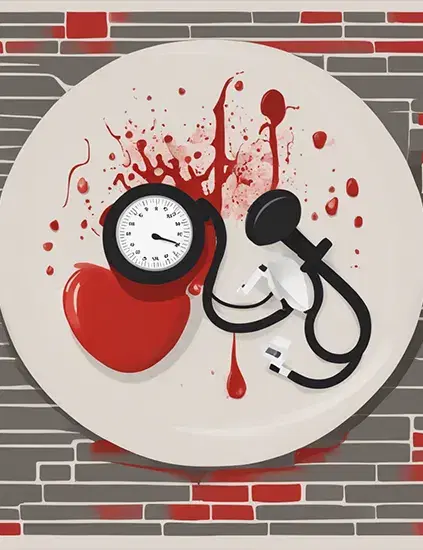
Vastu Tips For BP Control: Time to Shift Your Burner!
Hey there! It's a common thing, you know, to have blood pressure probl...Read More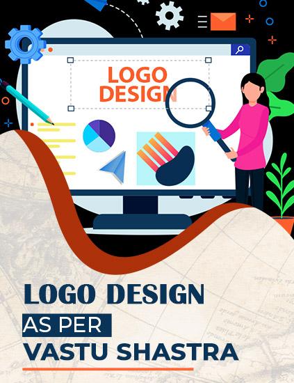
Logo Design As Per Vastu Shastra
Logo design as per vastu must be directed in the upward direction whic...Read More.jpg&w=750&q=75)
Factory Vastu: A Blueprint for Success
By incorporating Vastu principles into your factory's design and layou...Read More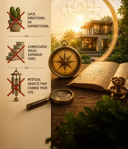
Vastu Shastra Myths: What Classical Texts Actually Say
Vastu Shastra myths, debunked. See what classical texts like Brihat Sa...Read More
Vastu For Rental Properties: Enhancing Well-Being and Success
Living in a rented property doesn't mean you have to forgo the benefit...Read More
Enhancing Your Child's Education Through Mahavastu Principles
As parents, creating an optimal learning environment for your child is...Read More
Logo Design And Branding As Per Vastu Principles
Incorporating Vastu principles into logo design and branding can be a ...Read More
Vastu for North-East Facing House: Classical Rules & Room Guide 2026
A north-east facing house is considered the most auspicious in Vastu S...Read More
Creating A Vastu-Compliant Garden : Tips For Natural Harmony
A Vastu-compliant garden is not only visually appealing but also a sou...Read More
Vastu in the Kitchen : Energizing Your Cooking Space
Cooking in the kitchen is more than simply a means to an end; it's the...Read More
Vastu Compass And Directions : How to Find the Facing of Your House
Vastu Shastra, the ancient Indian science of architecture, lays great ...Read More
Creating an Optimal Floor Plan for Residence Based On Modern Vastu Principles
Designing an optimal floor plan for a residence based on modern Vastu ...Read More
Unveiling The Path To Harmony : Common Vastu Mistakes To Avoid
In our pursuit of a harmonious and prosperous life, it is essential to...Read More
Decoding The Path To Harmony : Choosing A Proficient Vastu Consultant
Choosing a qualified and experienced Vastu consultant is a vital step ...Read More
Unleashing Abundance : Harnessing Vastu for Wealth and Prosperity
Incorporating the principles of Vastu Shastra into our living and work...Read More
Vastu for Good Health: 12 Tips That Actually Make a Difference
Struggling with low energy, poor sleep, or frequent illness? These 12 ...Read More
Enhancing Relationships with Vastu Shastra
In the journey of life, the quality of our relationships is a determin...Read More
Name Correction in Numerology: Solution to Many Life Problems
Name is everything and this is the reason why people focus on having a...Read More
Produce Quality, Earn More: Follow Vastu Tips for Factory
Vastu Shastra is all about design and planning that helps in building ...Read More
Vastu Tips for Commercial Space: Follow And Earn More Profits
Vastu is an imperative part of commercial space as it can affect the w...Read More
Vastu Colors for Home: What Each Direction Actually Needs
Which Vastu color belongs in which room, and why direction matters as ...Read More.jpg&w=750&q=75)